Thank you to Korea Society of Design Trend for including me in this years International Invitational Exhibition. detra.org


Thank you to Korea Society of Design Trend for including me in this years International Invitational Exhibition. detra.org
A client of mine wanted to attract potential customers to their booth at a trade show, so they brought me in to do ‘live painting’ at their 20′ x 30′ booth. For two days I set up my easel and painted on a 4′ x 4′ canvas. It really drew people in. The paintings were being raffled and people could drop a business card or get their badges scanned to enter to win. It was a fun way to start conversations between the sales people and the attendees. Below is a photo of one of the completed paintings. I painted in their five 25th anniversary colors.
You can also view paintings that this client has purchased and given to business partners and employees as recognition.

Indigo Creative is AIGA Santa Barbara’s Feature Designer.
http://santabarbara.aiga.org/featured-designer-series-indigo-creative/
Article by Indigo Creative’s writer Robert Hyndman

Sponsor: Douglas Bartoli Memorial Fund. Size: 12′ x 12′. Proceeds go to The Children’s Creative Project. This year we’ll be recreating an original piece by Maria Rendon. Stop by and see us – Melissa Mahoney and Maria Rendon


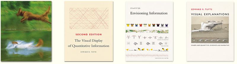
I attended an excellent workshop by Edward Tufte, in Los Angeles last week. Below are some notes I took. He has published four books that have a wealth of information as well as amazing charts and data displays.
http://www.edwardtufte.com/tufte/
Data displays (charts)
Focus on causality; interaction of cause and effect
Lines = verbs, arrows = nouns, dotted lines = uncertain data
Causality is visually expressed on the (linking) lines. That’s where the action is.
Drives you to causal thinking (verbs not nouns)
Every design movement should carry content or data
Don’t order tables alphabetically, show in a logical order
Ask, what is your story?
Ask, why should they believe you?
When gathering data use ‘Whatever it takes’ principle
Have a spirit of inquiry when looking for data
Don’t cherry pick data
Chart chunk = replace large amounts of data or numbers and simplify
Segregate data by content, not by mode of production
Establish credibility: send links to data you find, source note, diversity of data
Show credibility by showing mastery of detail
Parenthetical: at least until better evidence or alternative explanation is found
You want an open mind to other possibilities, but not an empty head
Fundamental Principles of Analytical Design
(from Beautiful Evidence, Edward Tufte, pp. 122-139)
1. Comparisons (contrasts and differences)
2. Causality, Mechanism, Structure, Explanation
3. Multivariate Analysis (more than 1-2 factors)
4. Integration of Evidence (whatever it takes attitude)
5. Documentation (credibility)
6. Content Counts Most of All
Analytical presentation ultimately stands or fails depending on the quality, relevance and ingenuity of its content.
Strategy for non-fiction reports / presentations
Know your content, respect your audience
Engage audience using first person language (I, we); second (you) or third (they) person speaks down to the audience
Story + credibility
Analytical design comes from analytical thinking (mainly done to make comparisons)
Arrange information to help intellectual task
Cognitive tasks are turned into principles of evidence, presentation and design
Get rid of design; it’s an impediment between interface and viewer
Short / intense presentation
Increase information and throughput
Strip out jargon
How to make a presentation (cognitive style)
Print out Summary: problem, relevance, solution
Print out Technical Report, don’t show as a slide. High res data dump
Budget questions on another handout
Presentation points out the things that are important, follow by discussion
Meeting is about information consumption = good. We, the person, are not the center of attention.
Have really good content
Show up early (to the meeting you’re leading)
Finish early
Flow diagram
Intriguing texture of content is a sign of good design
Genuinely interactive, giving a cue to look further
High information (detail) shows access to design
People have a high capacity for information processing
Note: information travels the optic nerve at a rate of 20 megabytes / second
Design
Enhance signal by reducing the amount of noise (other signals)
Don’t use legends or codes if you can avoid them (they impair learning)
For comparison, show things in adjacent space (instead of flipping)
Deep stacking is clunky and hard to follow
Use small multiples as an effective way to display information
Tables: recommend Gill Sans or Trebuchet
Interface design
Should be 90% content
Managing the flood of material and relevance of information
Fast scanner: yes, no, look again
Sparklines
Small word size graphics that display quantitative information
Show recent recording and last 500 (+/-) readings
Note: cognitive bias to put too much weight to most ‘recent’ information
Sparklines might not be technically accurate, but give the right answer to the question
Galileo’s first book used symbols (great change in cognitive thinking)
Notes
The publication ‘Nature’ has best data displays
The sports stats charts are also well done
Find a super graphic about your field
The publication ‘Library of Science’ is a beautiful journal
Napoleon’s March Chart was designed to be an anti-war poster
The Elements of Geometry, 16th Century, Euclid
Beautiful Evidence book (page 137, read this) Principles of Analytical Design
It’s that time of year again… May 29-31. Here at the Santa Barbara Mission, my friend Maria Rendon and I will be working on a 12′ x 12′ chalk drawing. Our sponsor is the Douglas Bartoli Memorial Fund and we’ll donate our time and the proceeds go to The Children’s Creative Project.
This year we’ll recreate an image of a Balinese dancer with beautiful silk robes and gold ornamentation, framed with intricate architectural elements. I just travelled to Ubud, Indonesia in March of this year so the imagery continues to weave into my design and now our chalk drawing. Come by and see us if you’re in town.
Thanks for all the support through the weekend. It was a super fun year!


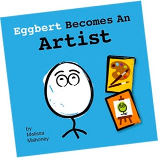
I wrote and illustrated a children’s book last year. It’s for children around 2-5 years old. It was inspired by my new little niece, and is available for purchase through Lulu. One day it would be fun to be a cardboard book, but for now it’s heavy paper.
eggbertcreates.com
When choosing a paper for your print projects, it’s best to try to specs papers that use post consumer fibers or that have environmentally friendly production methods. Below is a chart for deciphering the icons and options.

I like to start the new year by looking at my own business vision and goals. I read this and thought Martha Stewart had a great way to step back and assess your own business.

Ensō is a Japanese word meaning “circle” and a concept strongly associated with Zen. Ensō is one of the most common subjects of Japanese calligraphy even though it is a symbol and not a character. It symbolizes enlightenment, strength, elegance, the universe, and the void; it can also symbolize the Japanese aesthetic itself. As an “expression of the moment” it is often considered a form of minimalist expressionist art.
In Zen Buddhist painting, ensō symbolizes a moment when the mind is free to simply let the body/spirit create. The brushed ink of the circle is usually done on silk or rice paper in one movement (but the great Bankei used two strokes sometimes) and there is no possibility of modification: it shows the expressive movement of the spirit at that time. Zen Buddhists “believe that the character of the artist is fully exposed in how she or he draws an ensō. Only a person who is mentally and spiritually complete can draw a true ensō. Some artists will practice drawing an ensō daily, as a kind of spiritual exercise.”
Some artists paint ensō with an opening in the circle, while others complete the circle. For the former, the opening may express various ideas, for example that the ensō is not separate, but is part of something greater, or that imperfection is an essential and inherent aspect of existence (see also the idea of broken symmetry). The principle of controlling the balance of composition through asymmetry and irregularity is an important aspect of the Japanese aesthetic: Fukinsei, the denial of perfection.
I painted my first Enso last night. Circles are a prevailing theme in many of my paintings, but technically I had never painted an Enso. I used white paint on unbleached linen canvas that had a clear gesso. The clear gesso repelled my paint, so I created this Enso with three circle strokes, filling in some of the gaps. This does not follow the rules of making an Enso with one stroke… therefore supporting the Fukinsei philosophy of the denial of perfection… this philosophy makes me sleep better at night 🙂

